


Lesburu Analytics (yes, the name is real, and is in fact a typo...) was a project born out of the question, how fast do I really drive my Subaru? And can I finally make a project that uses cellular on a Raspberry Pi?
With that excuse in hand, I embarked on a project to automatically (and reliably) track my drives in my Subaru, hands-free, regardless of if my car was in an area with cell service or not, and to upload this data to my server in real-time.
And on top of this - challenging myself to make a frontend that showed the real-time location of the Subaru, summarize & analyze past drives, show music that was playing along the drive, and dig into all the data goodness I had on hand.
After 4 months of heavy development, by February 2024, I had a mostly working prototype of Lesburu Analytics. Further improvements for 3 more months made the stack more reliable and added features to the frontend.
Lesburu Analytics ended regular usage in May 2024 after I moved to Boston where I wouldn’t have a car. However, the Lesburu Analytics hardware remains prepared to use at any time (and the stack remains online), so whenever I go home and can drive the Subaru, I always hook Lesburu back up!
That means that, as of July 2026, Lesburu Analytics has logged 141 trips, 171,079 GPS traces, across 4,811 miles of driving in 8 states and 2 countries.
—
Languages Used: Python, CSS, JavaScript
Frameworks Used: Socket.IO for comms, Flask, MariaDB, SQLAlchemy, Alembic, Pydantic, gpsd, ModemManager, Selenium, React, Vite, MUI, Google Maps JS API, SQLite3, Spotipy & the Spotify Web API (phew, what a list!)
Hardware: Raspberry Pi 3B+, Sixfab LTE HAT, SIMCom SIM7600G, Globalsat BU353-N GPS receiver, Adafruit PiRTC DS3231
Timeframe: November 2023 - Present
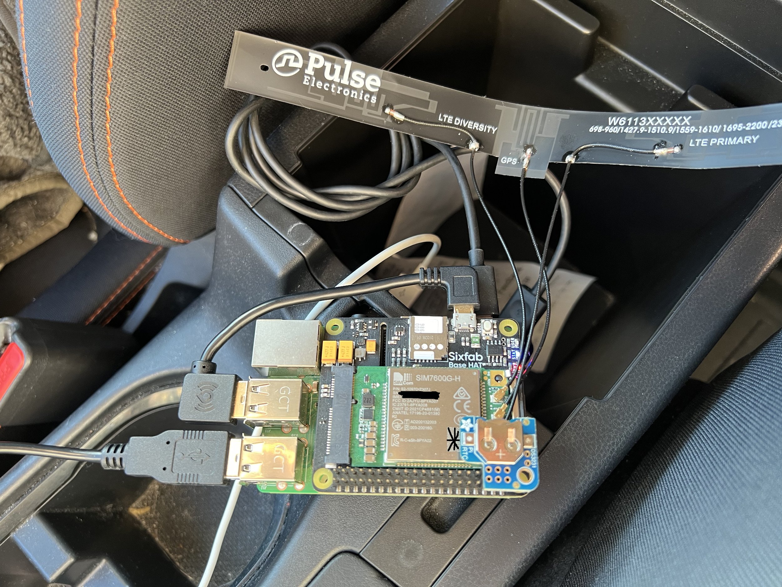
This is the hardware setup for Lesburu Analytics.
The base of this project is a Raspberry Pi 3B+ running the latest version of Raspberry Pi OS (Bullseye as of this project). On top of that is the Sixfab Cellular HAT, which is where the modem, antennas, and the SIM card sit. The SIM is a Sixfab Super SIM, in turn, a Twilio Super SIM that runs on T-Mobile and AT&T in the US. It also works in Canada, a real-life test undertaken for the 2024 Total Solar Eclipse!
The LTE modem used in this project is a SIMCom SIM7600G-H. Previously, I bought a Telit ME910C1 LTE-M modem, but found it had weak reception and horrible connectivity issues while in motion. Fortunately, one of my friends couldn’t use the SIMCom modem in his ThinkPad, and sold it to me! The joys of going to a tech school, where you can ask your friends if they have a spare modem lying around.
On top of the modem is the DS3231 Real-Time Clock, made in a HAT friendly form by Adafruit. By default, Pis do not have a RTC, they acquire time from the internet (or use the time the system was last powered on). This presented a massive problem when starting trips, especially since the modem takes a long time to connect.
With the RTC, logging can immediately begin as soon as GPS reception is received. It also enables a nifty trick that will continue a trip if the Pi only has been off for less than 15 minutes.
On the modem HAT there's three LEDs visible - one for modem power, one for modem connection status, and one user-programmable. The user LED is how Lesburu indicates its status, in nominal operation, it blinks once for a GPS trace logged, and once for uploading a packet. Any more blinks than that represent a problem.
The button is used to shut down the Pi gracefully, hold it down for ~0.3 seconds and the Pi will...shut down. This is to avoid SD card corruption with forceful shut downs by taking the car keys out.
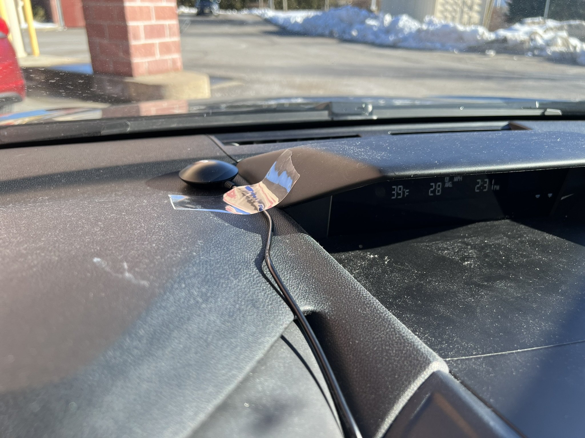
On the dash is the entire brains behind Lesburu Analytics, the GPS receiver. It's a Globalsat BU-353N, which is a USB-based, high-precision, but GPS-only receiver. It's worked pretty well for this project. It has good acquisition time (~30-40 seconds from a dead cold start) and relatively good accuracy (but it starts to fall apart in dense city areas). I got use to the wire running from the dash to the center console pretty quickly.
I should've used a GNSS receiver that can tap into multiple constellations for better accuracy (and those receivers aren't that much more expensive).
The bill of materials for this project was pretty cheap overall, landing around $150 or so. Cellular costs range around $8-$10/mo (depending on how much driving I'm doing)...but also the data transmission is horribly inefficient (it's Socket.IO over HTTP since Apache WSGI can't forward websockets).
But for a 4-month project these data costs were plenty fine.
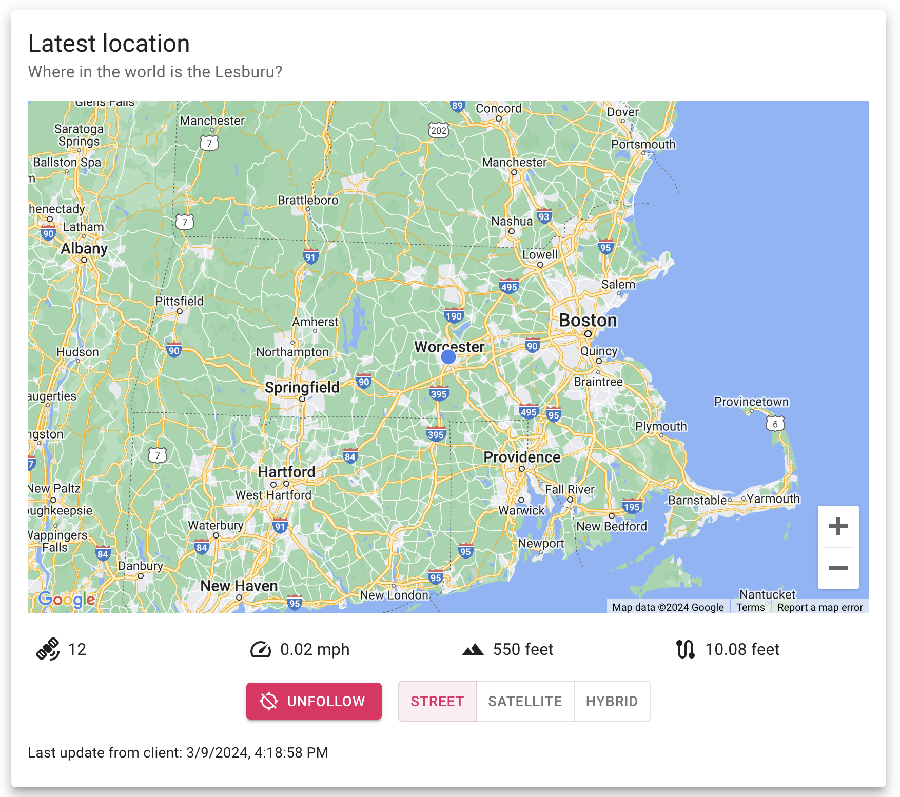
Let's start the tour of the Lesburu Analytics homepage. The first thing you see is, when the Subaru is on, the live location of the car.
Live tracking of the Subaru was one of the first things I wanted to implement in this project, and the architecture of this project makes it possible.
The window also shows a couple stats - how many GPS satellites are being used to get the location, current speed (although in later revisions I removed the decimal places), elevation, and distance travelled for this trip.
There's controls to center/uncenter the map on the car, and to change the map mode. With React Google Maps, I found the map type controller would flicker on rapid state changes, so this was the workaround.
(also - the map usually isn't this zoomed out)
When the Pi hasn't reported a location in a while, the latest location switches to showing the last location of the Pi. The timestamp of the last reported location is also included.
During drives, the Pi nominally uploads a GPS trace every 2 seconds - I found this to be a good balance between accuracy of a drive and not having too much data (if I did 1 second intervals, that'd be 220,000 traces!) to deal with.
There is a ton of logic behind the scenes to ensure every packet gets uploaded successfully. This was the hardest part of this project and getting near 100% successful data delivery took right until the last month this was running.
In short - a combination of a SQLite3 database on device, being efficient with traces when the car hasn't moved too much (which includes lowering the data upload rate to every 10 seconds/every 10 feet moved, whichever comes first), and requiring acknowledgements from the server within 1.25 seconds before locally deleting a packet.
Right below the last location box is the Trips section, which, as the name suggests, lists all the trips taken with Lesburu Analytics.
This section is paginated for 10 trips on each page. Each trip has an auto-generated title (using Mapbox's reverse geocoding API to get where the trip started & ended) along with the start & end time.
From there, there's 4 statistics about the trip - its duration, the distance travelled, the average speed, the maximum speed, and a rough estimate for the CO2 emitted.
Next to that is a photo of the trip trace. This is a 360x360 image captured using Selenium using a custom page in Lesburu Analytics that I built for this purpose.
A newer addition to Lesburu Analytics is the ability to sort the drives by practically any of the metrics (aside from CO2 emitted which, looking at it now, I might just add for fun) in ascending or descending order.
This is great to see the shortest trips (which include moving the car around the block, or when the Subaru dealer moved it into the garage for service), or when I felt a need for speed.
Before jumping into the trip page (which is the meat and potatoes of Lesburu Analytics) - there's two more boxes on the homepage I'd like to talk about.
The first one is the Lifetime Statistics, which as the title says, is the tl;dr of Lesburu Analytics!
Shown is basically all the stats collected from all the drives. Some cool statistics include elevation gain (which is defined by an increase of at least 10 feet in elevation in the eyes of Lesburu Analytics), the highest elevation being correct and the lowest elevation being a GPS error, time stopped/moving, and then the number of trips & traces for each of those trips.
When a trip concludes or when a trip is deleted, the lifetime stats are automatically updated.
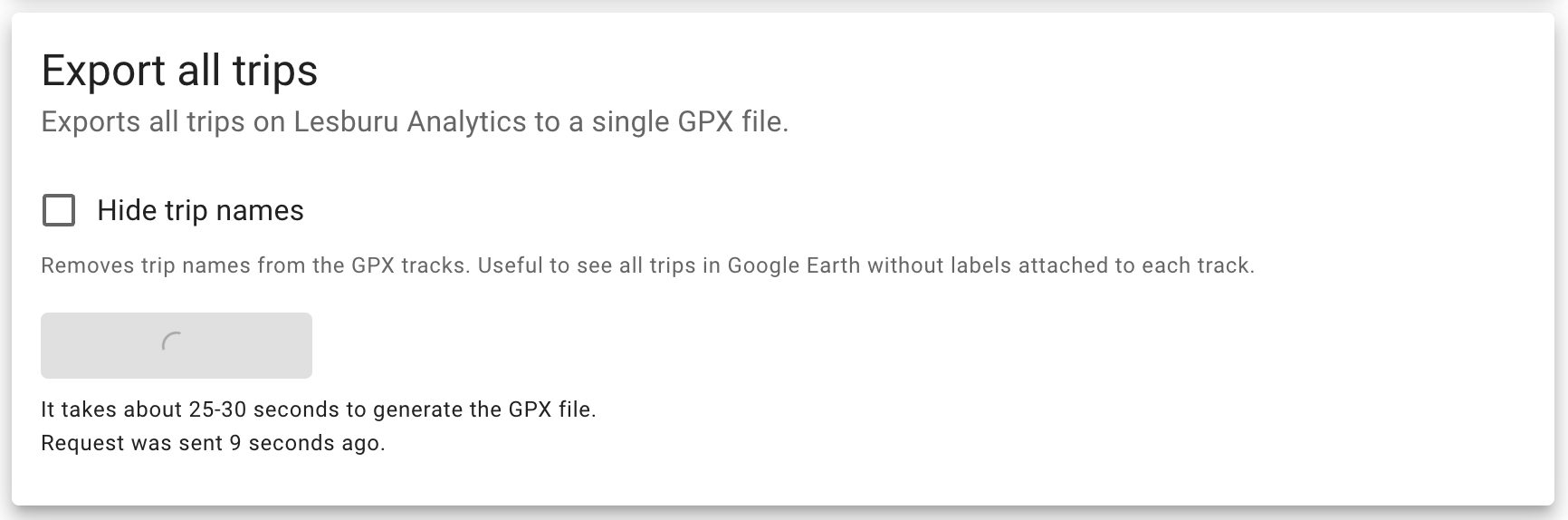
And just below that is the function to export all trips to a GPX file. This was a pretty late-game addition I made since I wanted to be able to see drives in something like Google Earth Pro. I thought why not make a method that exports all of them!
There's an option to not label trip names so that when you look at all the tracks in Google Earth. By default, each track is named whatever the trip is called in the database. So on Google Earth, you have about a dozen "Insert week-of-day-here trip in Worcester, MA" labels popping up. Just makes things cleaner.
I need to also experiment with adding trip details inside the description of the trace, but perhaps I'll get to that when I'm very bored.
Since gathering 117,000 traces from the database and assembling them into a GPX file takes a little while (especially on my VPS which is definitely not the most powerful thing), I added a timer for how long ago the request was sent along with how long it usually takes.
Just a little bit of good UX practice when dealing with long-lasting requests.
Alright, it's the part you've all been waiting for! The trip page is the meat and potatoes of Lesburu Analytics, and let's go through it section by section.
First is just the title box, which basically mirrors what's on the trips box on the homepage - the title and start/end time of the trip.
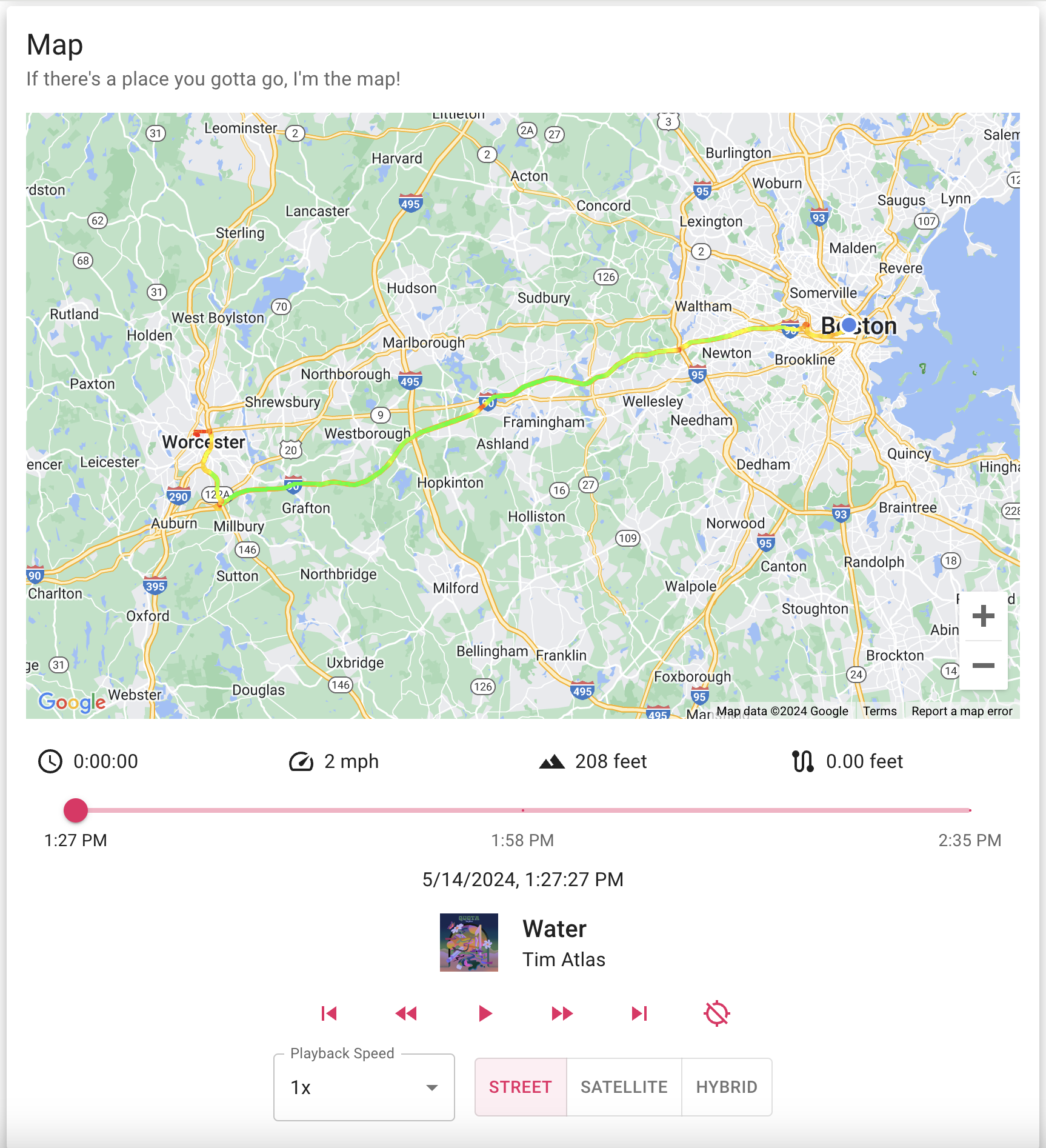
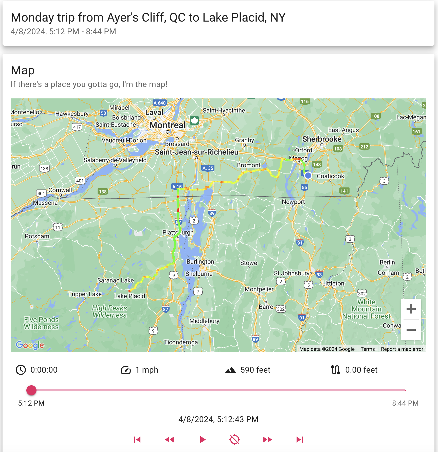
And now here's the Map box. This is really the superstar of Lesburu Analytics - let's unpack everything.
Up first is the actual map, showing the trace of the trip. The location of the Subaru is depicted by a puck, or when in motion, an arrow showing the (approximate, as derived by GPS traces) heading of the Subaru.
Below that are 4 metrics for the drive - a trip timer (replacing the GPS satellites on the homepage), speed, elevation, and distance travelled so far.
Below that is the slider that you can, indeed, use to just slide through the entire trip on a whim. It has time points at the start, end, and middle for context. The exact timestamp of the trace being viewed is below that.
For any drives taken after April 28, the track that was playing in the car at that time is also shown. I'll talk more about this integration in a later photo.
Below that are 6 control buttons - 5 of them are for controlling the playback of the drive (rewind to start, back a trace, play/pause, forward a trace, forward to end). The sixth button enables following the Subaru's location on the map as playback progresses.
And below that is controls to change the playback speed - anywhere from 0.5x to 3x speed (basically changing how many milliseconds between traces), and then the map mode changer.
Phew, that's a lot.
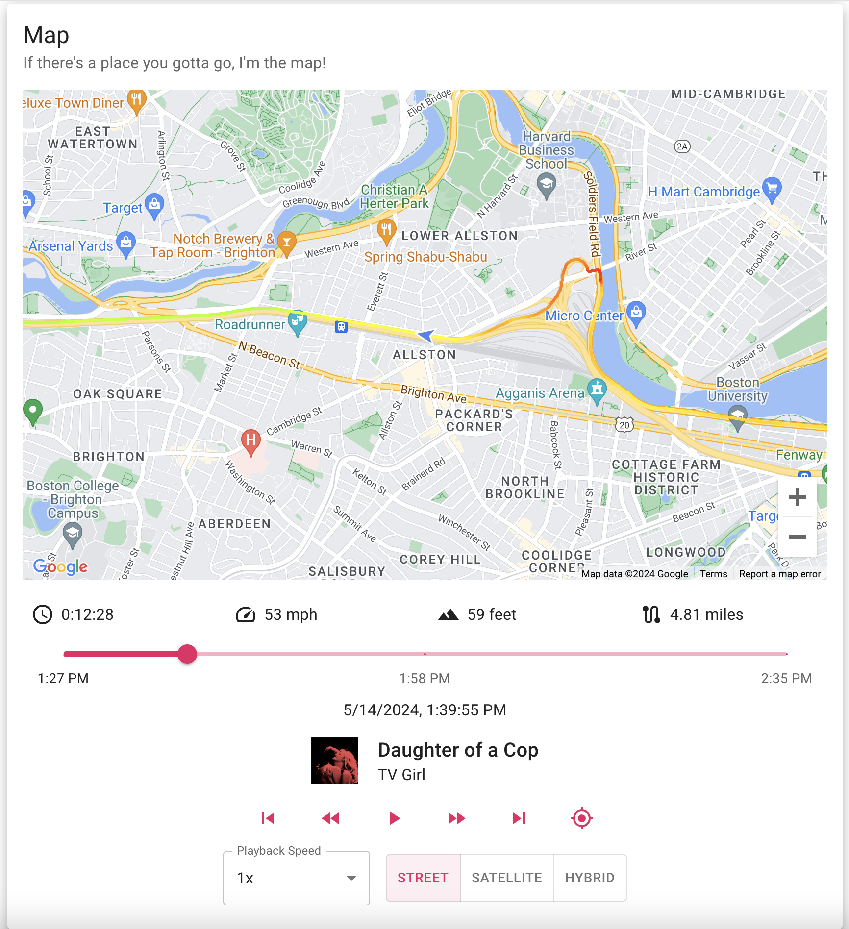
And here's a quick screenshot of what the map looks like when sliding through a trace with centering enabled.
Here's a quick demo showing the map functionality on a drive I took to pick up my new adopted cat (his name is Archie and he is an absolute rascal). It's a bit laggier than usual since I was recording my screen, but you can see how flipping between playback speeds work, the Spotify track history, etc. I had to make the video run for 2 minutes to avoid YouTube making it a short.
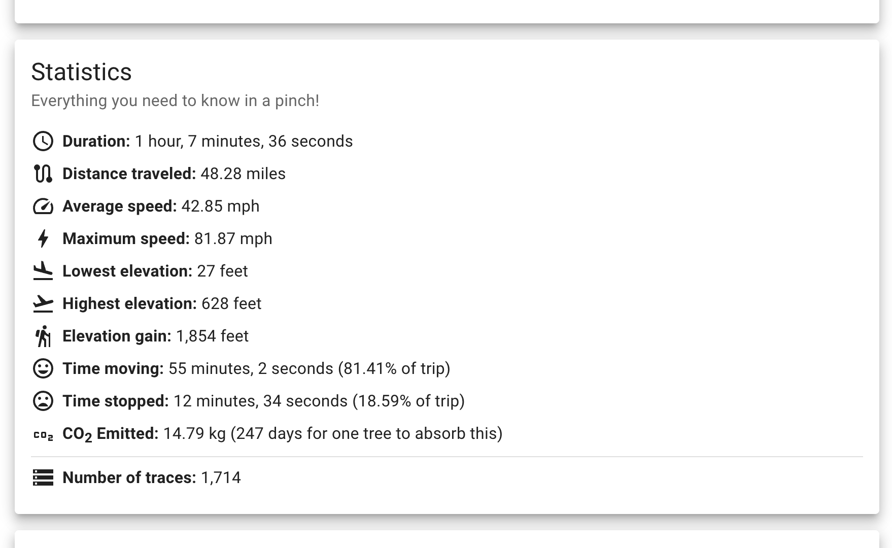
And below the map box is the statistics box for the trip. If this looks familiar, that's because it is! The lifetime stats box got its inspiration from this box (and by inspiration, I mean I copied the whole thing).
All the data goodness you can get right here.
Below that is a more recent addition to Lesburu Analytics, tracks played during the drive.
Using the Spotipy library, I was able to hook into the Spotify API to get the list of my recently played tracks. Using the magic of if statements, I was able to filter down that data to tracks played during the drive.
Developing this feature had quite a few fun quirks to it.
First - Spotify only counts tracks played all the way through in the API, if you skip a song 10 seconds before it ends, it won't count. That's not too much of an annoyance. But second, and much more annoyingly, the timestamp attached to a song is when it ENDS playing. Not when you started playing it.
This was a tad confusing when showing the song playing while driving in the map box - but it wasn't too much to tackle. I save song duration data as well, so it's easy to calculate the range of time a song was playing.
Otherwise, I made this box to show the full table of songs played in chronological order, with album artwork, song name, artist, album (which hides on <576px displays), and time played. The table is paginated to show 10 rows on each page.
Due to the slapdash nature of the Spotify integration - this only worked for a couple of weeks, and it was not working when I used it during the 2024 holidays.
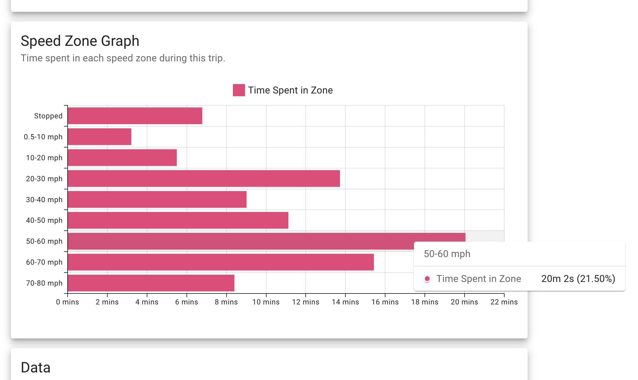
Below the Tracks played section (or Statistics section if the drive was before April 28) is the speed zone graph. This is a graph showing how long was spent in 10 mph blocks of speed, also known as a speed zone.
Hovering over each bar shows you the exact time and the percentage of the total drive spent in that zone.
Lesburu Analytics considers any speed below 0.5 mph as stopped, so that's why the second zone is always 0.5 mph - 10 mph.
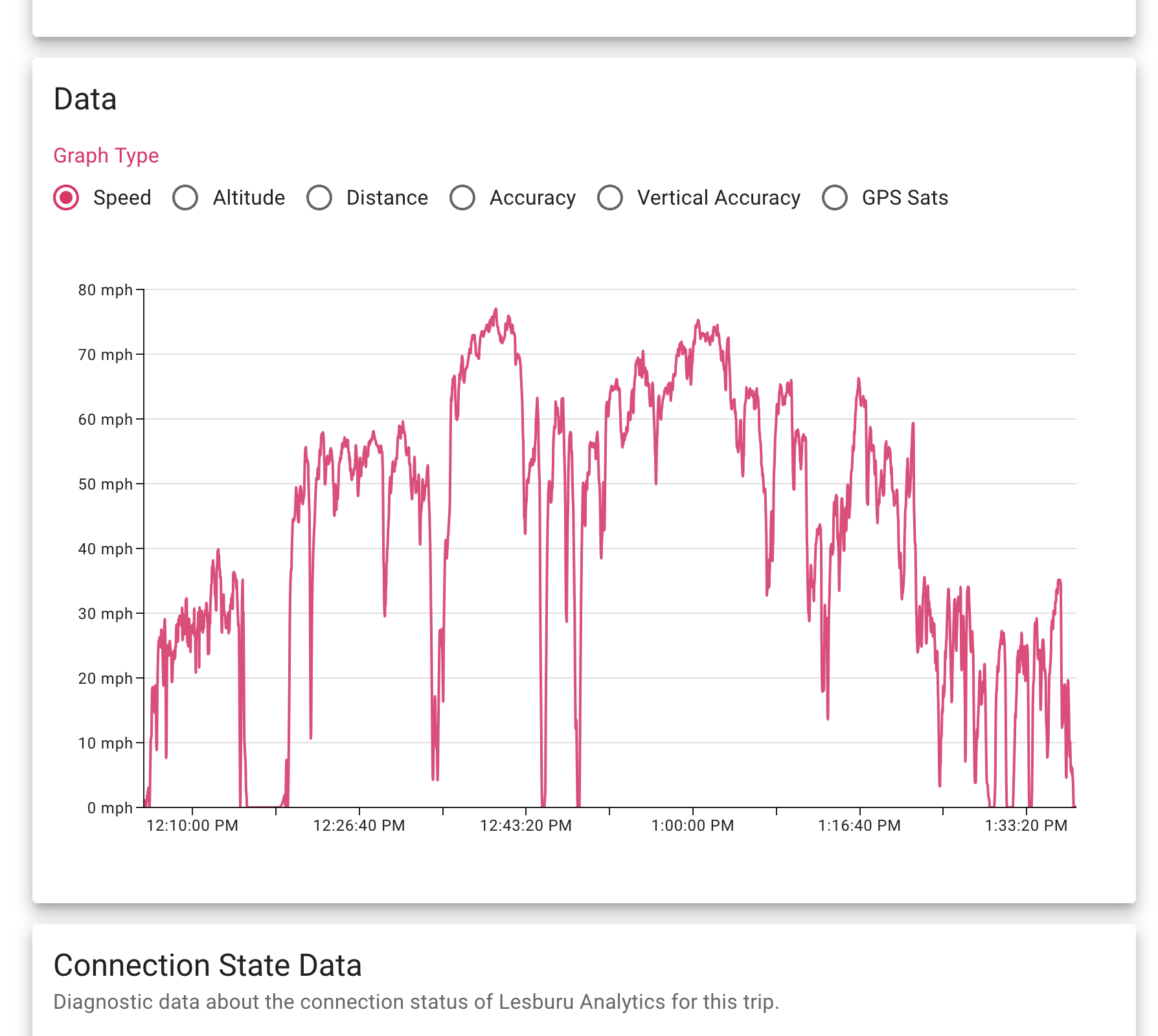
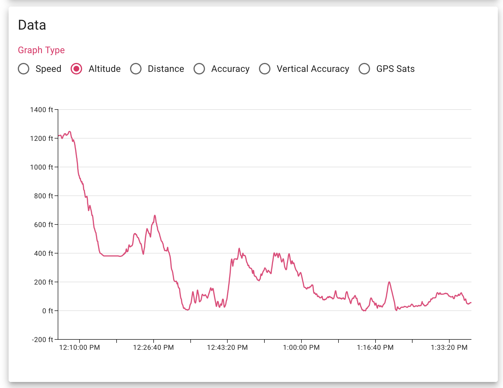
And right below the Speed Zone section is the Data section! Of course it wouldn't be an Owen McGinley project without some sort of graphs...so here they are.
There's six different data types you can glance at - speed, altitude, distance (over the course of the trip), and then horizontal/vertical GPS accuracy along with how many GPS satellites were in view.
As the project was winding down, I switched graphing libraries from chart.js (used while the project was alive) to MUI X for better consistency of design. The images on the project page have been updated to show this.
Until you actually look at the elevation profile of a drive, it's hard to reckon with just how hilly our roads are (to be fair this trip starts on a mountain but I digress)! Tons of these little elevation changes have racked up that massive elevation gain statistic in lifetime stats.
Here's a quick preview of the distance metric, showing distance travelled as the trip went on. It's a different (but still pretty cool) way to visualize a trip. You can see that at the beginning of the trip, I was stopped for a bit to get some gas, and this is visualized as no distance increasing.
When the charts were using chart.js, I installed a plugin to allow for zooming & panning on the charts, meaning you could more easily see data for a section of a drive. Here's an example of a 6-minute cross-section of a highway drive.
MUI X charts do have zoom/pan functionality, but it is behind a (rather expensive for personal use) paywall, so I opted to save my $540 and put it towards an Eiffel Tower light kit instead (read my review on the Blog page). Much better value, anyway.
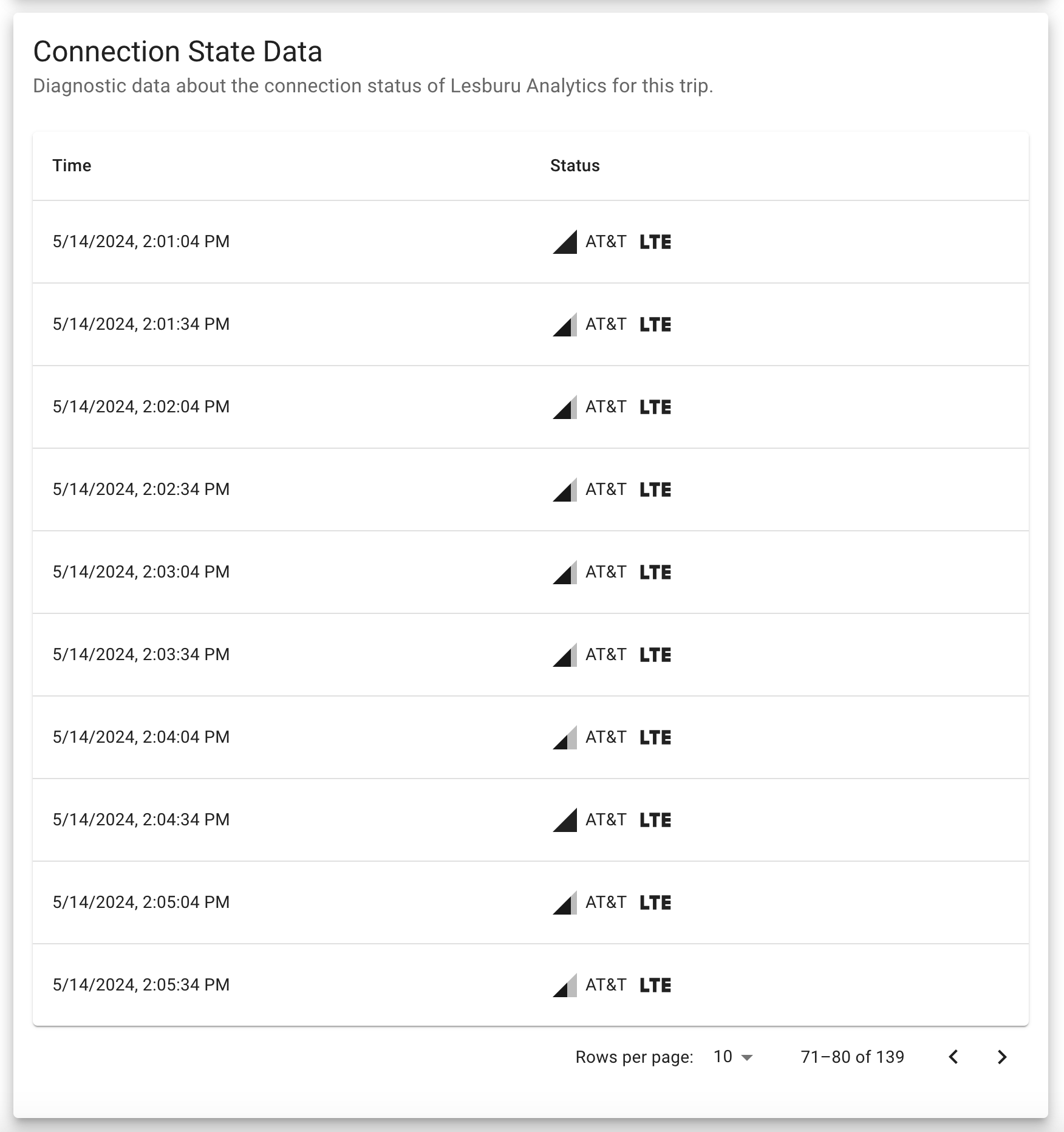
Below the Data section (there's a lot of sections...) is a Connection State Data section.
This was added a week or two the Spotify integration so I could get a peek into how the Pi in the car was connected to cellular networks.
Every 30 seconds, the Pi will pull information from ModemManager about connection quality (closest thing to signal strength that's easily accessible), access tech, and the operator ID (operator name is always Twilio, but you can see if the Pi connected to AT&T or T-Mobile via the operator ID).
That's then displayed in this table, which is paginated every 10 entries (similar to the Spotify tracks), but with a customizable number of entries per page.
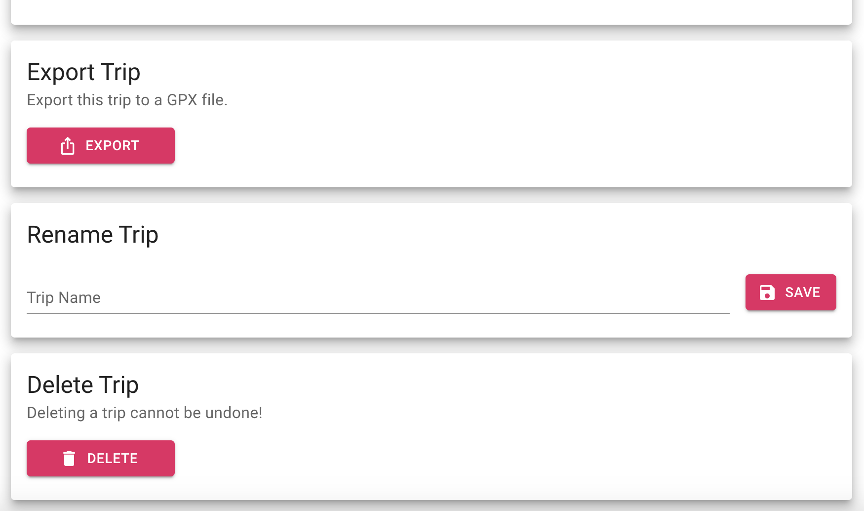
Right below that are three administrative boxes that do exactly what they say - so I'll go over them quickly.
Up first is the Export Trip function - very similar to the one on the homepage but it just does it for the specific trip.
Below that is Rename Trip, if I want to rename a trip to something other than the auto-generated one. Whenever a trip has a custom name, the UI will show the start & end location beneath it to maintain the contextualization.
And below that is the Delete Trip box which, crazy enough, deletes a trip. With a confirmation box, of course.
Whenever a trip has a custom name, a restore button will appear under the save button. This allows for a very elegant way to restore the auto-generated trip name.
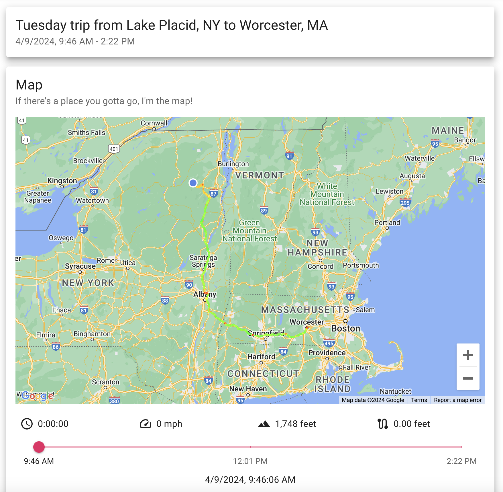
There are two Lesburu Analytics trips I want to highlight before closing out - and this is my second favorite one.
This is the trip I took from Lake Placid to Worcester after seeing the 2024 Total Solar Eclipse - a drive that was 268 miles long, took 4 hours and 36 minutes, and generated just over 8,000 GPS traces.
And Lesburu Analytics got the whole thing perfectly. It was like a magnum opus moment for this project, being able to log a ridiculously long trip, then when I got home and sat on the toilet (always gotta do a post-drive poo), watch the entire drive on my phone.
Technology is magical.
But my favorite trip has to be this one - coming back from Ayer's Cliff in Canada to Lake Placid after totality. I drove 3.5 hours out there to avoid cloud cover in the Adirondacks.
This drive did have a couple of snafus - the Pi requiring a reboot after crossing into the US due to switching networks (and incompatible DHCP leases), and packet saving to disk being half broken for this drive. Both of these bugs have ben fixed! But despite the glitches, it was incredible to see most of this international drive logged in the Lesburu Analytics system, which is why this is my favorite drive.
This project taught me quite a lot and was not easy to develop. Just getting the right hardware was a challenge since I'd never ventured into the world of modems or GPS modules. The software on the Pi was equally as challenging to develop, even just to start interfacing with gpsd, construct socket connections, and then reliably log every packet while being mindful of GPS edge cases. Getting 99.9%+ reliability on the stack took at least half a dozen iterations, and I could go on for ages about the early issues this project ran into.
But that's the fun of a project like this! I had to come up with out-of-the-box, novel solutions to the very specific issues I was having.
But at the end of the day, I'm so incredibly proud of this project. It has been one of the highlights of my coding career, showing off an incredibly tight integration of software & hardware working in concert to reliably track every single drive in the Subaru.