


The MBTA Screen is a 4-inch, Raspberry Pi-powered touchscreen that shows realtime departure information for any MBTA stop. The screen was designed for two reasons: not having to check my phone for train departure times while leaving the house, and to combine data richness into a modern UI with incredible attention to detail.
The screen is designed for information density that transit apps do not match. It’s easy to see if the next train coming is new, shorter, stopped en-route, is delayed (but hasn’t been declared as stopped), etc. As the project expanded, I added trip connections, which shows upcoming trains at a connecting stop, and if I need to run for a train when I get there. On top of that came alerts, a weather widget, and fun features.
And last (but certainly not least), I added the ability to print information from the screen to close the loop on the not having to use your phone part of this project.
I use the MBTA Screen every day when leaving my apartment. Since it’s been installed, I’ve hardly missed a train, and never have had to wait on the platform for more than 2 minutes (unless the train got delayed). It materially makes my life so much easier that my girlfriend has a copy, and my desk at work got one too. We need more purpose-built gadgets in life.
—
Timeframe: September 2025 - Present
Languages & Frameworks: Python, FastAPI (for data)/Flask (for Pi kiosk control), Pydantic, React, Mantine.
—
Please note: If you are viewing this page in a wide window, please narrow it so you can see photos/screenshots and their accompanying text! Squarespace is not the best at showing vertical photos at a reasonable height-to-width ratio.
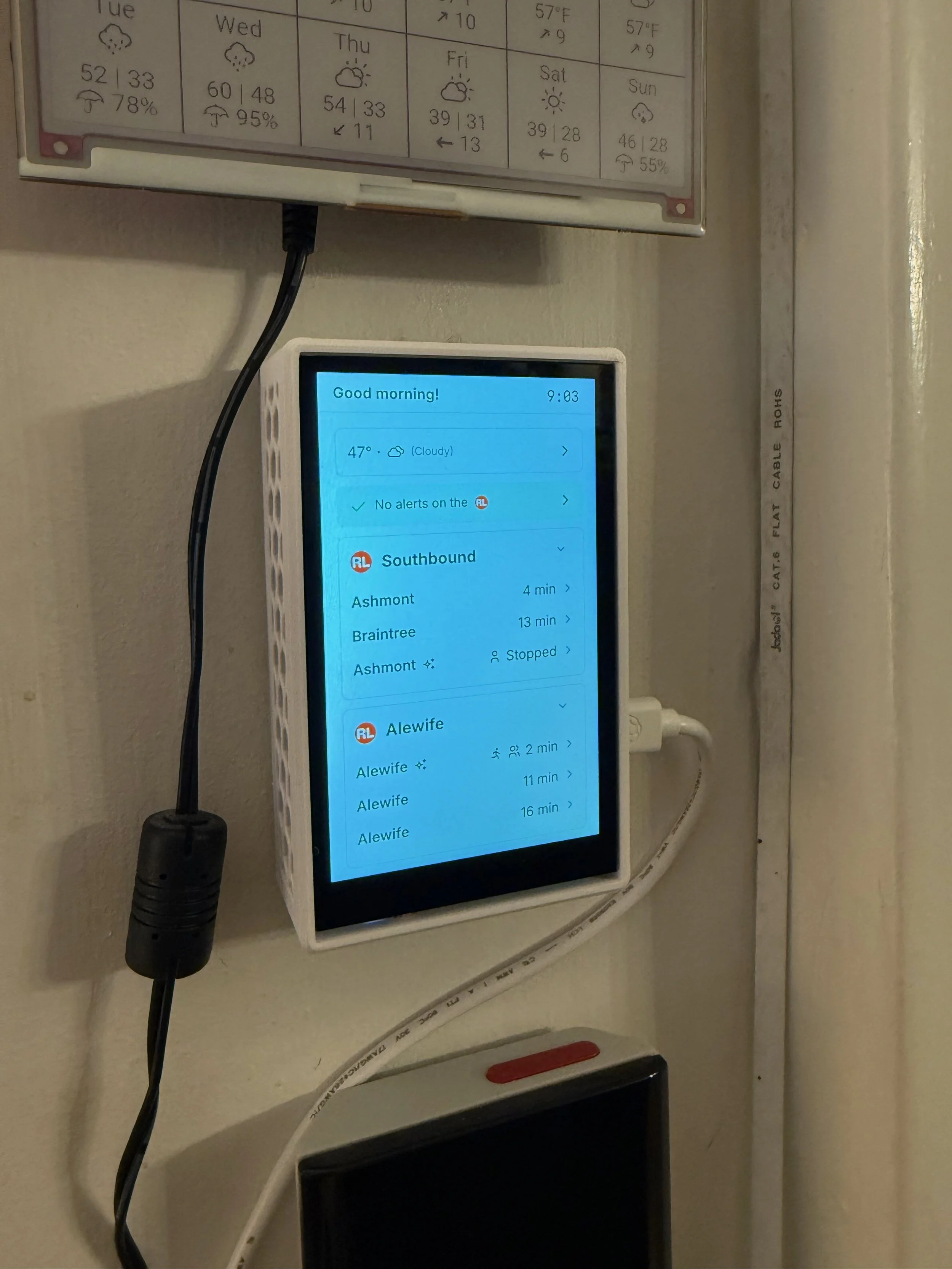
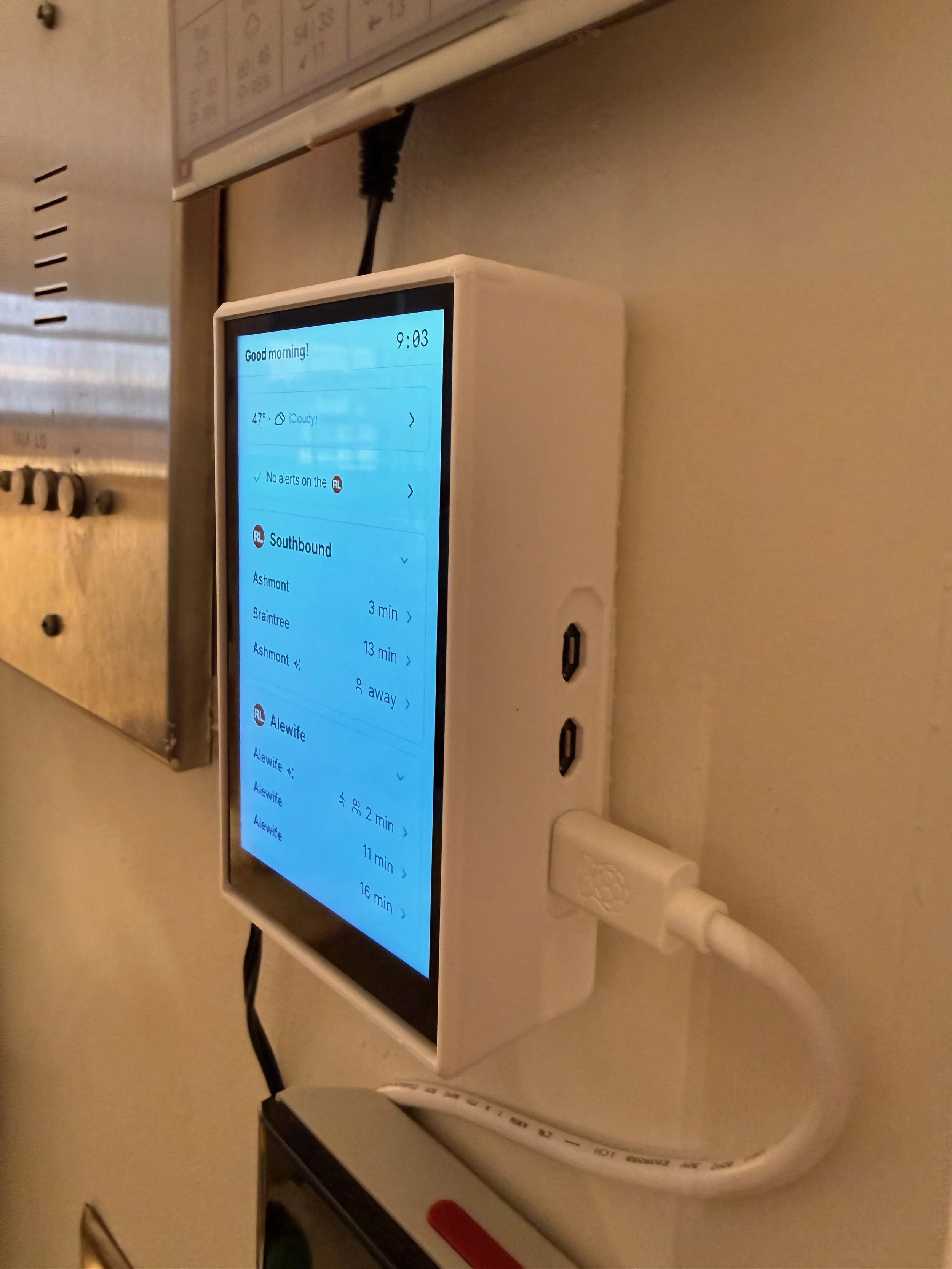
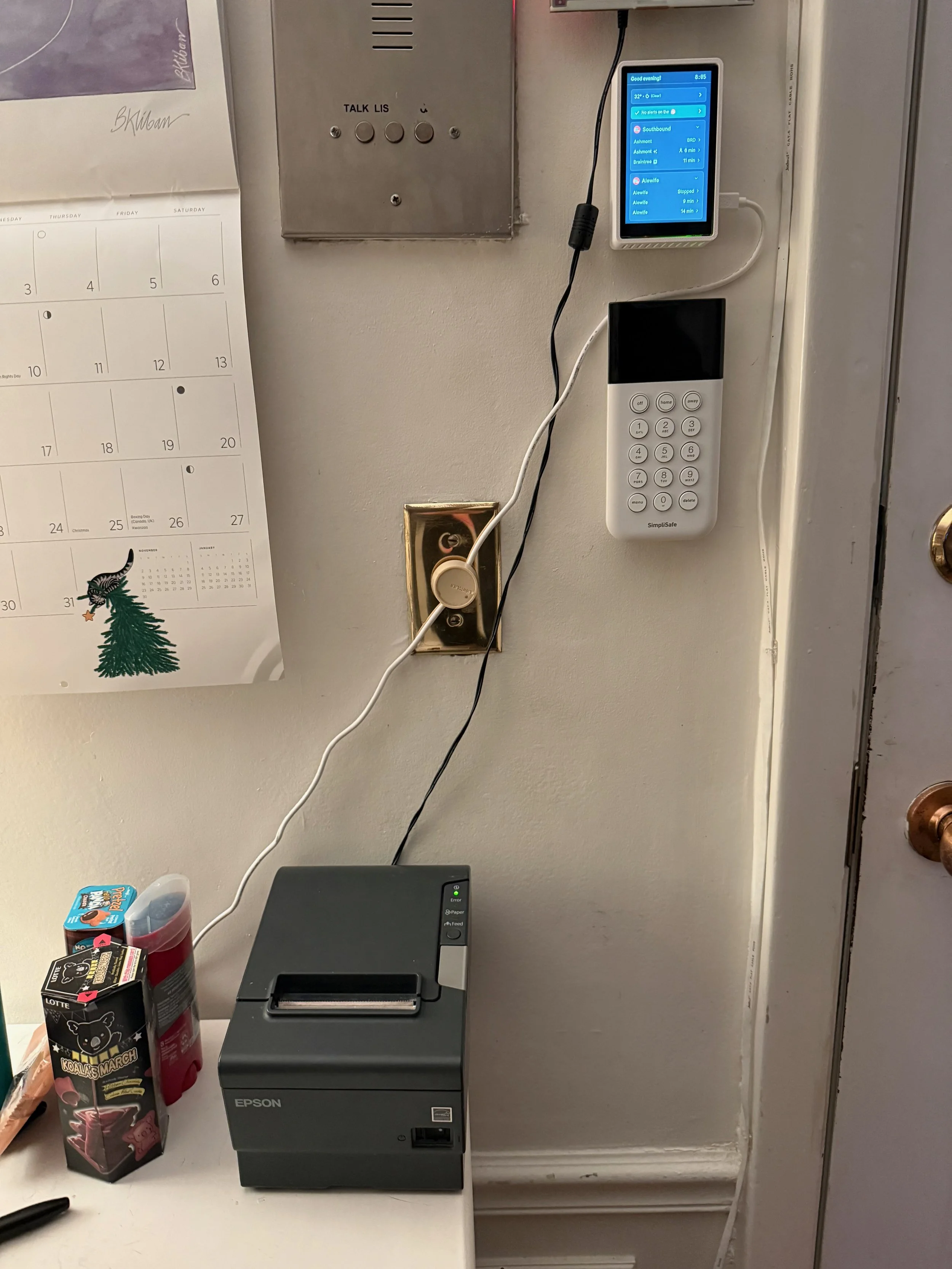
Here is the MBTA Screen in the wild. Much more on the UI/UX shortly - let’s start with hardware.
The screen runs on a Raspberry Pi 5 with 2 GB of RAM, and the screen is a Pimoroni Hyperpixel 4.0 with touch enabled. The screen is 4 inches diagonally at a resolution of 800×480 (same as the iPhone 5/5S). The case is 3D-printed in PETG for heat resistance, and is connected to an official 27W Raspberry Pi power supply that is overkill.
Here it is in the flesh, in the wild, my latest project of 2025, the MBTA Screen. We’ll have a lot more to talk about with the UI/UX, but let’s start with hardware.
While the screen itself is 800×480, due to the high DPI, the software runs at 533×320, so 150% scaled. It strikes a good balance of enough information density while being readable from 6-8 feet away.
The screen turns itself off after 5 minutes of inactivity, after which, the entire application goes to sleep and doesn’t fetch data. When you touch the screen, data loads in again.
By the way - my phone is doing a really bad job exposing the screen - it is not this washed out in person!
Here’s a side profile of the MBTA Screen hardware package.
There isn’t much to talk about on the Pi side itself - it’s just a Raspberry Pi running Raspbian Trixie with the Pi Desktop enabled. Enabling the Hyperpixel is as easy as adding a dtoverlay in the boot config file, then setting the mouse to run in multi-touch mode.
The Pi has a few functionalities I’ll talk about here. The screen is run by a Chromium kiosk wrapper around a React + Mantine website hosted on my web server, it’s deployed using Vite & React Router. The Pi has a minimal Python + Flask HTTP server for controlling the kiosk service: this is for automatic updates & controlling the settings menu on the UI. Labwc is used to run the 5-minute screen timeout and set the backlight to 0% if no activity is detected.
The screen is pulling data from a middle-man API that I built that acts as a translator between the MBTA API and the screen. Rather than stuffing all the logic on the frontend for API fetching, I do it from the MBTA Screen API. Also, separation of concerns.
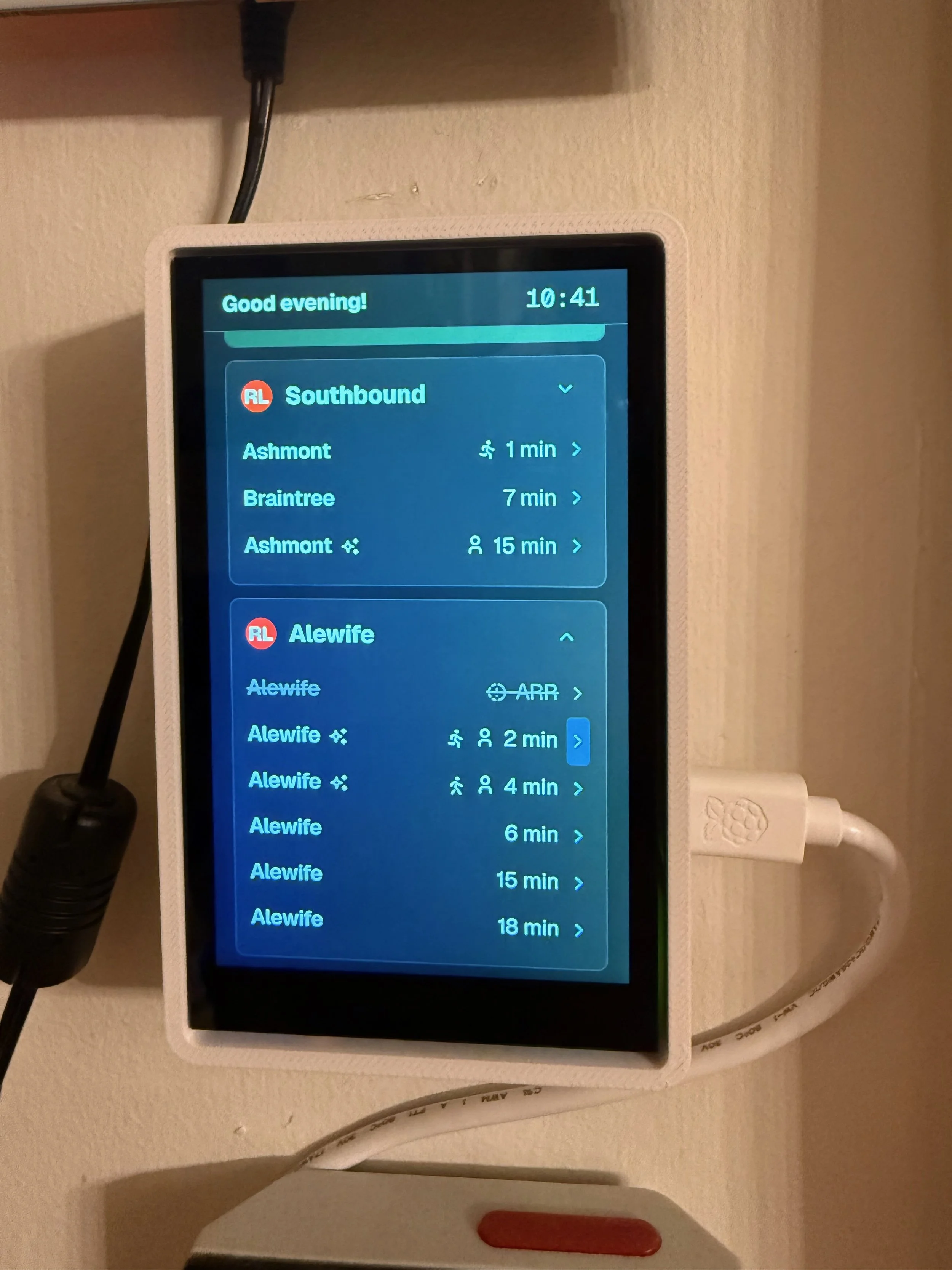
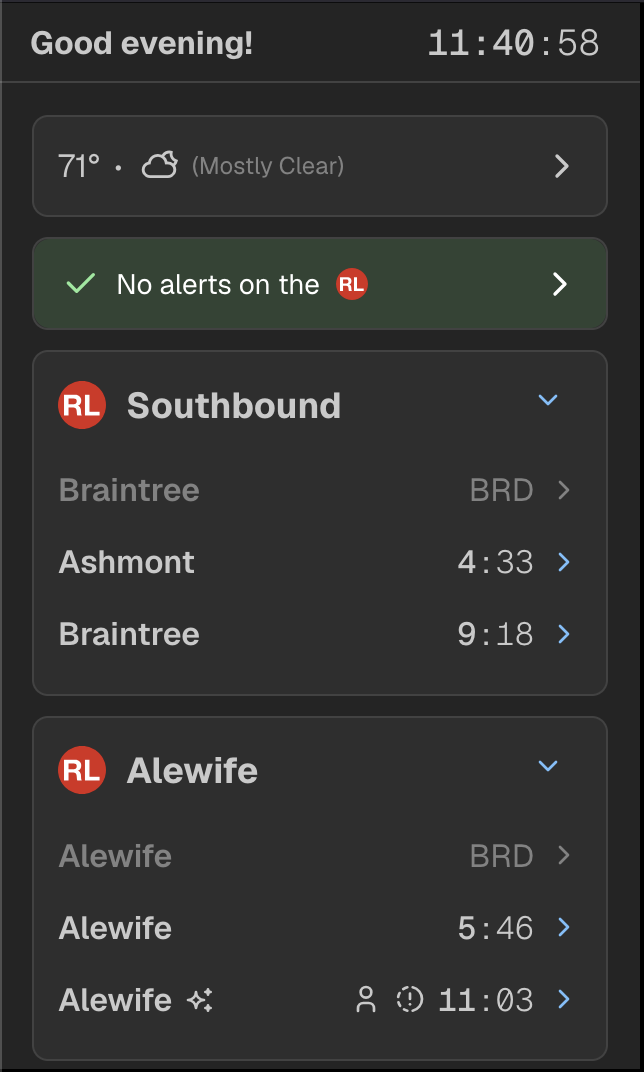
Here is the home page of the MBTA Screen! There’s lots to discuss.
At the top of the screen is the persistent status bar that shows the time and a little message on the left. You’ll quickly see that this disappears to a back button on other pages. You can click the time to also see the current date too.
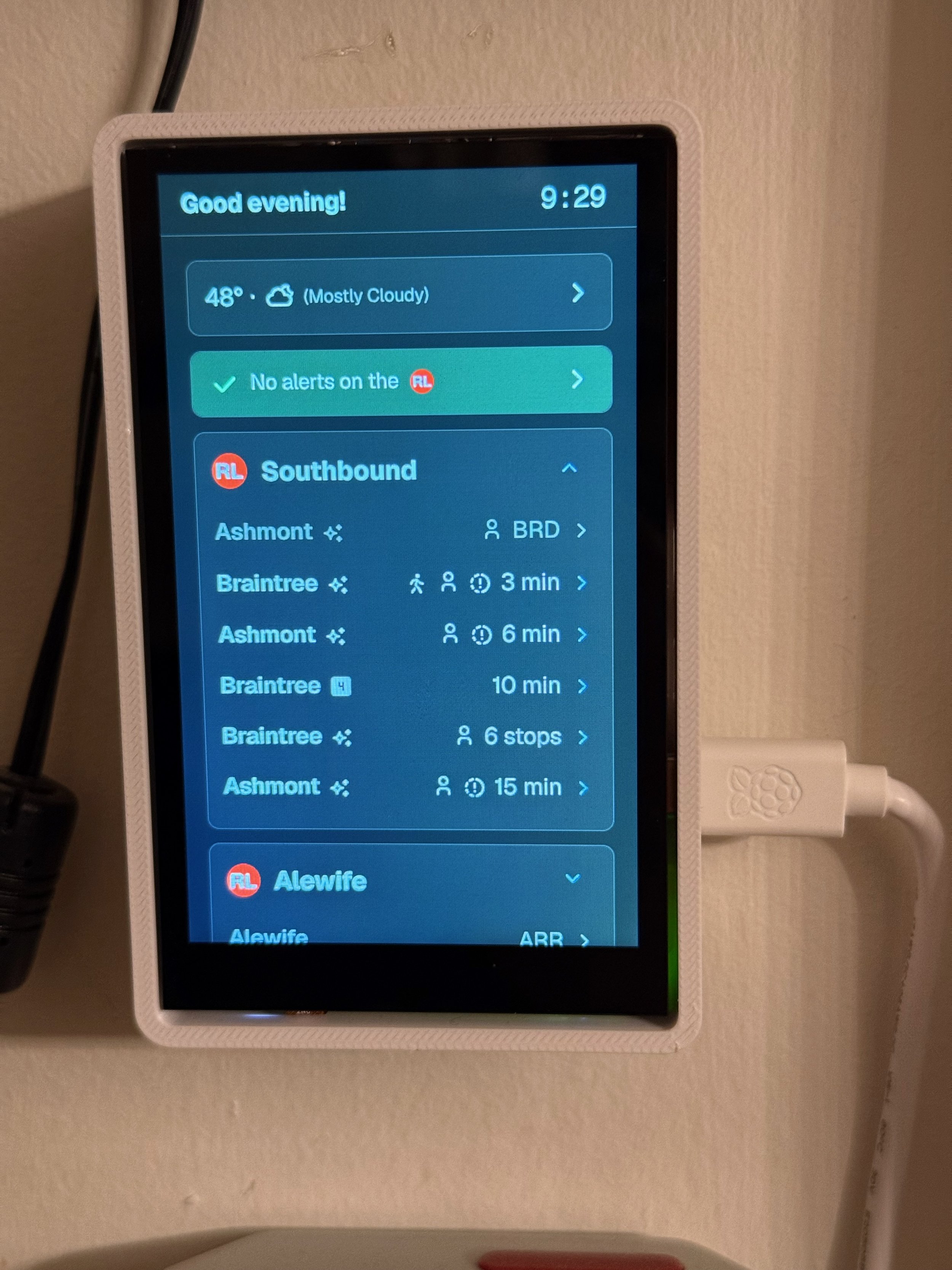
Up front - just enough vertical room spans the weather widget, using the Beacon Hill Weather API to get real-time data from my own weather station. Tapping brings you to the weather page, more on this soon. Below that is the alerts - tapping this also brings you to a dedicated alerts page…more on that soon!
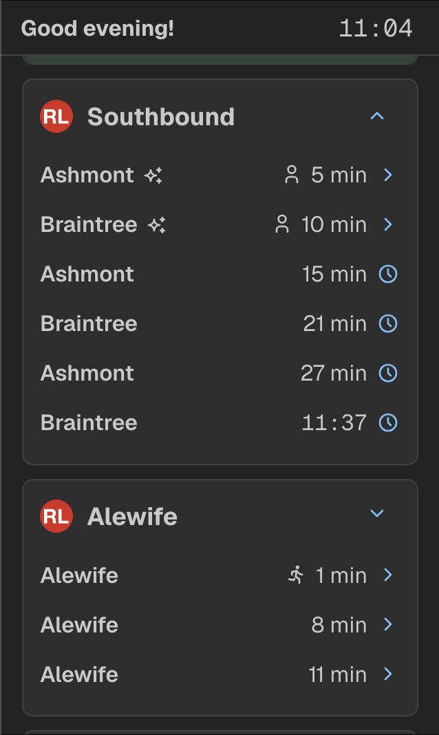
Below that are the train predictions. 3 predictions are shown, but you can click the arrow to expand the box and show 6 predictions. For trains that are arriving or boarding: the proper ARR/BRD text is used and is greyed out (meaning you cannot reach this train unless you are an olympic sprinter?) - but I can configure the threshold this occurs at.
The loveliest part of the screen are the walk and run icons! At least for me, I know I’m about 4 minutes from the station, and if I run, I can make it there in 2.5 minutes. So, the walk icon comes up right when I need to start walking to the train!
A few other things to notice on the home screen: if a train is new (on the Red Line) or has occupancy data (new trains on the RL/all trains on the OL), then it’ll show that as well, with the person indicator showing 1-3 people depending on the crowding level.
Up at the top - you’ll see a little clock icon next to the last departure. When there are no more real-time departures to display, the screen falls back to scheduled departures with a minimum 90 second gap between the last predicted departure to the next scheduled departure.
In fact - the entire MBTA Screen can fall back to scheduled departures at any time throughout the system, it is universal! This is amazing for stops on the Green Line especially out west on the B/C branches, or for when predictions are acting up. This was the last feature implemented in April that made me think “now this project is really mature!” and went past just using the predictions endpoint.
Now, you may have noticed, wait, wasn’t the screen in light mode earlier, now it’s dark? Yes! You did! The screen has light & dark mode…but you can’t control it! It syncs with the sunrise and sunset so it automatically fits into the environment. After all, a screen in dark mode with lots of natural light won’t look great…and a screen in light mode with just artificial light would be blinding.
As promised - this is how the UI looks when expanding the departures. When a departure is more than 30 minutes away, I opt to show the time of departure rather than minutes. It’s an interesting UI design that, in a way, lets you know this train is so far away it’s probably not relevant right now, but here’s what time you should start thinking about leaving. I’ve fiddled with the threshold to show the actual time - it use to be 15, then 20, now it’s 30 minutes, and I like it there.
Now, that’s cool and all, but the MBTA Screen has a lot of smarts that come up infrequently. Please forgive me for I have sinned and these are not screenshots, but maybe you can see how cool this is!
When a train has four cars on it, it gets a nice little “4” badge next to it. This is particularly useful to know when connecting at Downtown Crossing, because you want to be at the back of the train for the fastest connection (did someone say connections by the way?).
Infamously, the MBTA countdown clocks will say a train is Stopped 6 stops away, but flash in the order of “Stopped”, “6 stops”, “away”. Because of the limited screen space here, I took a page out of their book and also flash it, but with 3 second intervals (they use 6 seconds afaik).
But what about a train that’s delayed that…isn’t coming up as stopped. The MBTA API takes a bit to officially recognize a train is stopped. That’s where the drift feature comes in - the timelapse icon with an exclamation point tells you that while the train isn’t showing up as stopped, the screen has seen its arrival time drift significantly enough that it’s probably stopped. This is a fantastic feature for seeing minor delays that don’t trigger the MBTA’s stopped train logic.
Think of it this way - I see a train that’s 2 minutes away, but has the delay drift on it, I can probably make that train. Or if there’s a drift icon on a train that’s 5 minutes away, I better hold tight and wait for it to go away. It’s all in the name of optimizing how long you’re out on the platform for.
And even better - if a train is going express past your stop (which happens very rarely on the Red Line but it happens sometimes!), the screen crosses out that prediction if the prediction endpoint says that it’s skipping your stop.
For the final train of the night (as indicated by the predictions), the screen puts “fin” in grey italics to indicate the end of service, a nod to the fantastic SNCF trains that I wish we had in America. Supposedly the French show “fin” on the countdown/departure screens for the last service but I couldn’t verify this anywhere or remember during my trip in France, but it looks classier than “last” or "last trip” so we roll with it.
(I admit, if this wasn’t my own project, I would use last)
So what happens when you click the little chevron next to each prediction? You reach this page! For southbound trains that you can connect with, you see an option of where you would like to connect, and a button to show the full trip schedule with all the stops.
Once expanded, you see all the stops along with the time that it is scheduled to arrive. Below that, you see the trip consist serving your trip. For all Orange Line trains and new Red Line trains, this shows the occupancy of each car (if available, and if the train is not on a reverse trip).
This trip timeline page works for scheduled trips, too, and the timeline is colored by each line (you’ll see shortly). The trip consist is dropped on scheduled trips. For any trip where you don’t have connections, the timeline is automatically expanded with no expand/collapse button present.
I think the one improvement to make is not having the chevron take up an entire line…coming soon!
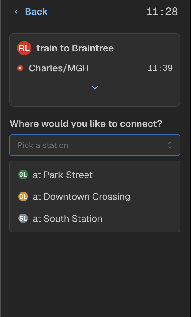
Alright, now let’s get into the meat and potatoes of why this screen exists: the connections. It starts with a form the screen wants you to fill out, so let’s go through it together! First, where would I like to connect? I’ve got three options for the Green Line, Orange Line, and Silver Line. Let’s pick the Green Line!
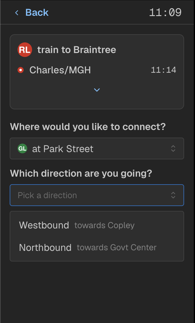
Then the screen will ask you which direction you’re going - are you going towards Copley or Govt Center from Park Street. This is to split up the next option that will be displayed.
Note that for the Orange Line, because you either go towards Forest Hills or Oak Grove, that the form stops here.
Lastly, the screen asks you whereabouts your final destination is. For westbound from Park Street, this is split into 6 segments based on the 2 trunk segments (B/C/D/E, then B/C/D) and 4 branches. For this example, I will choose Boylston → Copley, let’s pretend it’s really cold out and I don’t want to walk to Copley today.
After this, a submit button comes up, and…
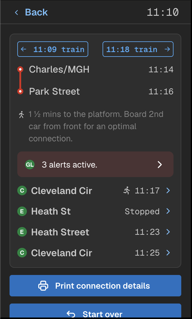
The connections appear! At the top: you’re shown the time the train is leaving, and when it arrives at the connecting stop. You can also switch between different trains to see how your connection is affected if you were to catch a later (or earlier) train.
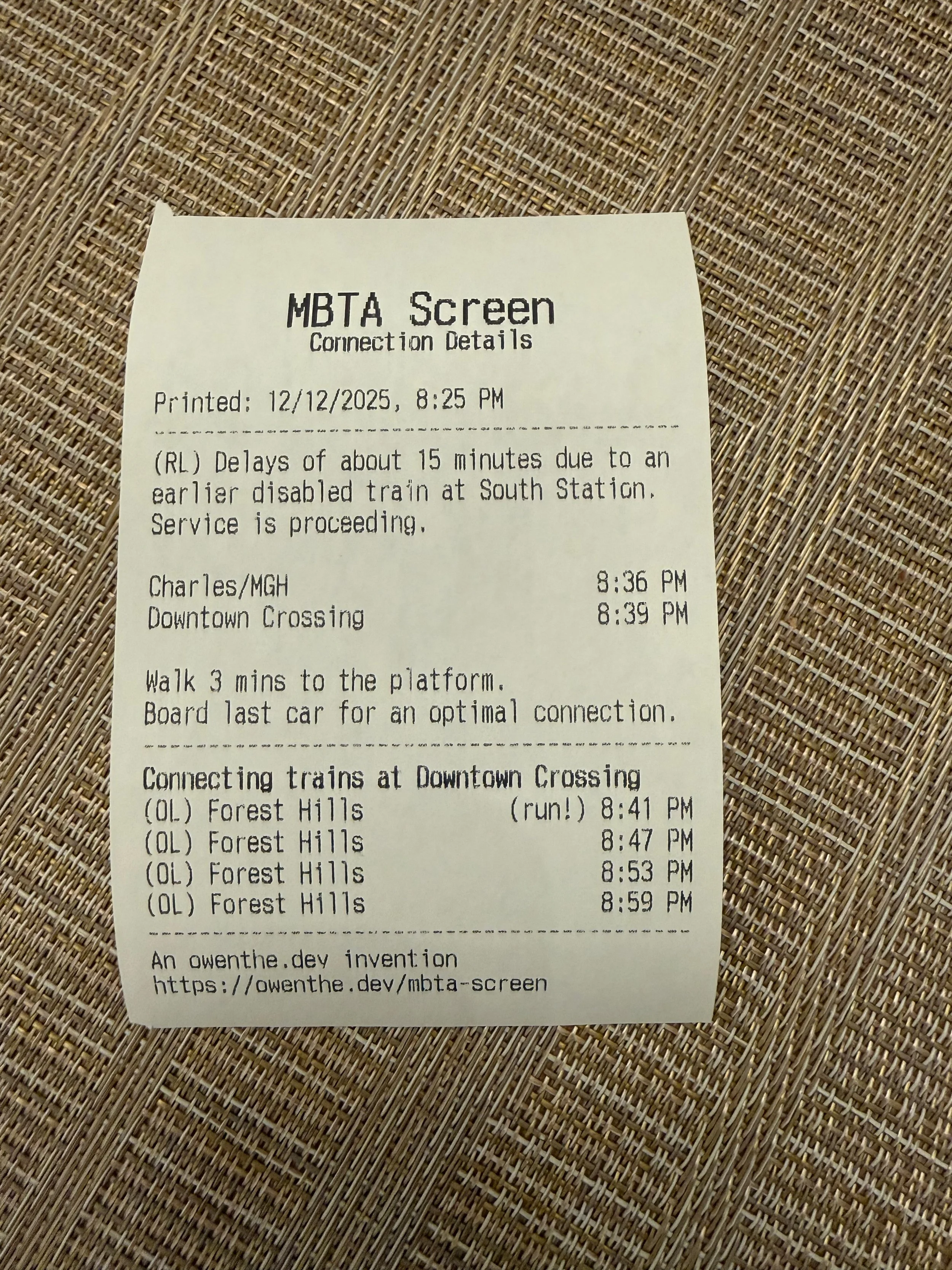
Below that, the screen tells you where to stand on the platform and how long it takes to walk to the platform. Walking times are part of the algorithm and are real walking times that I measured by going around all the downtown stations to each connection/platform, actually walking the connection with a stopwatch, and noting the final time. Finally, the screen tells you which car to be in for the optimal connection.
Below that you’ll see any alerts on the line(s) you’re connecting on. Due to some temporary station closures there’s 3 alerts on the Green Line, but laying that all out would sprawl the connections screen and have you scroll lots of text. For any alert bar systemwide, if the character count is > 200 (on the connections screen it is lowered further), the alert condenses into this bar and you can click on it to see all the alerts.
Below that are the connections. In this case, well, gee, maybe I should run for the Cleveland Circle train, knowing that the Heath Street train is stopped up the line. The stopped text will also rotate to a fourth status that shows the predicted arrival time with a tilda next to it (think Stopped → 6 stops → away → ~11:22).
Clicking the chevron (or clock if it is a scheduled departure, you can do scheduled connections on scheduled departures!), the same trip timeline shows up with all the stops and when the train arrives. This also shows you closed stops, RIP Symphony, it won’t be part of our symphony until 2029.
The trip timeline is very dynamic in that if a train is skipping stops, it will cross them out and say Closed (although I need to work on differentiating actually closed stops and skipped stops…), but the screen is always improving so there’s always work to do.
Lastly - here’s an example of that alerts modal that pops up if you click on the alerts bar and it doesn’t show the alert inline. This would be a dog to scroll through manually!
But shorter alerts make the cut on the homepage just fine.
Coming back to the weather screen - this was recently redesigned from the awful mess that it was before and it looks so much better. A nice two-column layout with tiles that are slightly inspired by Apple Weather are shown for all data points visible.
It even shows active weather alerts at the top (when they are active, the weather is good today) and system alerts from Beacon Hill Weather.
You can even click into the system alerts and read them! Unfortunately, I was tired and that microphone calibration did not happen…
Scrolling down the page a bit, you’ll see two more links at least for my version: predictions from the Bowdoin Blue Line station and then the settings screen (along with the build number). The extra links for stations can be customized - for instance, my work screen has the Red Line as predictions on the home page, but since I work near South Station, I have links to every other line since they’re all within walking distance.
This is what the Bowdoin screen looks like with the modified cutoff for run/walk on a train, and showing more of the scheduled departures. On this page, 6 departures are shown since Bowdoin trains only go eastbound, and the chevron to expand/collapse the predictions box is hidden.
The settings page contains buttons that are for maintenance - powering off the screen, restarting the display, or restarting/stopping the display service itself.
There is one setting though: seconds mode. Let’s discuss more on the next screenshot.
Seconds mode is inspired by the design of MTA countdown screens in New York (on the subway & LIRR at Penn Station/Grand Central Madison), in which they show the time with seconds in the top right. This extends to the clock in the top-right, showing the time with seconds (seconds in a thinner font weight), but also predictions down to the second. Now you know exactly when the train is arriving, and assuming the prediction doesn’t drift, it’s accurate to within 5 seconds or so in my experience.
When a train reaches the terminal BRD status (current time > departure time), that is shown instead. But the ARR status is replaced by having the countdown go all the way to 0 seconds.
Seconds mode originally inspired the drift feature, because you could see if a train was delayed in seconds mode by seeing if the countdown jumped up when a data refresh came in.
Seconds mode is extended across the UI: it shows up in trip timelines and the connections page. And this page is a cool example of the different walking times + car to be in on the train.
Now…in a few of the screenshots, you’ve probably seen “Print connection details” and thought…what?
A few months after the initial version of the screen was finished, I bought an Epson TM-T88V thermal receipt printer for this project. Why? I’ve wanted a receipt printer for a while but could not find an excuse to buy one. This project was the excuse.
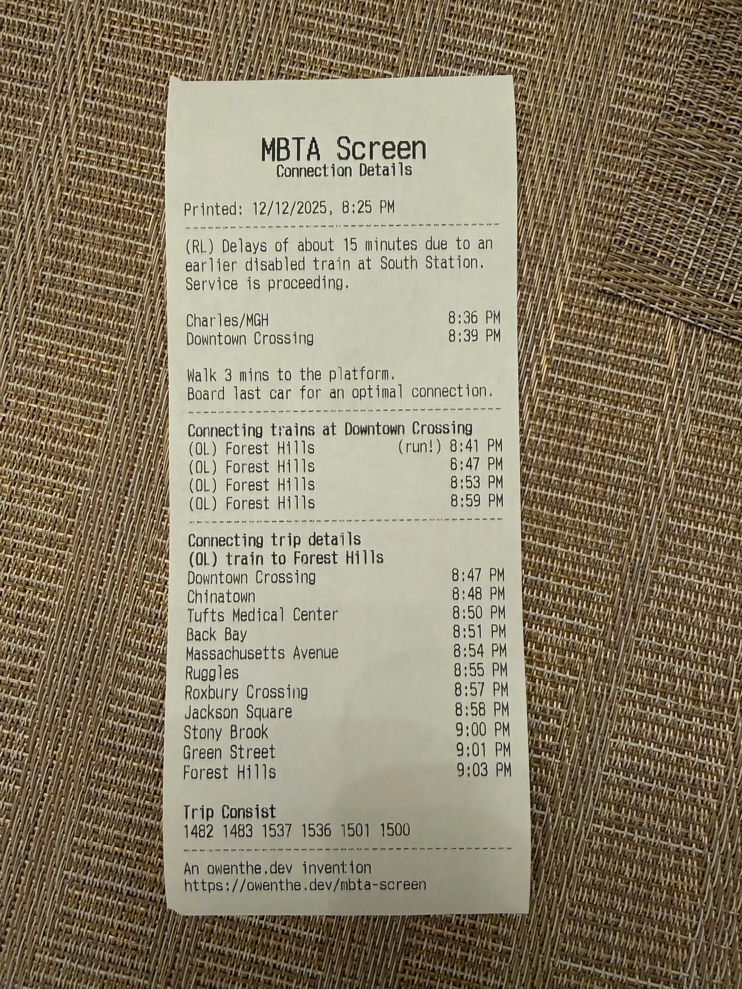
In short, the MBTA Screen allows you to print the stop list of any Red Line or Blue Line train, the connections screen, and the connections screen with a train selected. The logic goes that before you leave the house, you print out the details to carry with you.
Alas, we have smartphones, and printer paper cannot be updated in real time. Still, it’s really cool nonetheless, fun to hit print, great as a drunk party trick, and I spent some time designing the printouts to have good information density.
The printer is hooked up to a Raspberry Pi 3B using the python-escpos/flask library to handle printing/serving, and the screen talks to it over HTTP by sending it the data it has loaded.
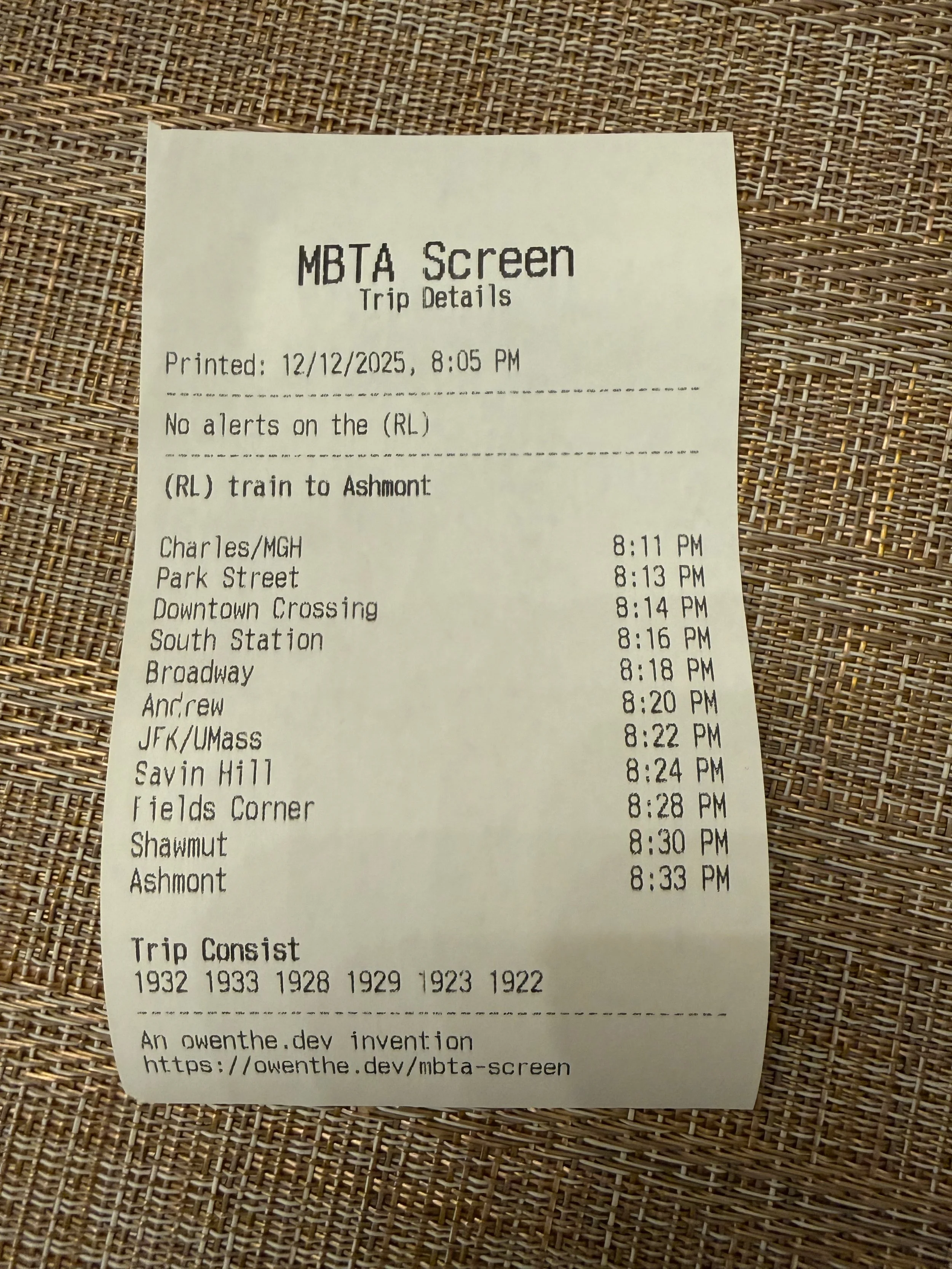
Here’s the first type of printout you can receive, which shows the details for a Red Line train. The paper shows when this was printed, alerts (if there are any), the arrival time at each stop, and the trip consist. The paper also has some shameless self-advertising at the bottom for whenever this is inevitably thrown in the trash.
The print quality isn’t too bad (although I don’t know what happened on the stop list) given this printer has 77.8 km on the thermal head & almost 320k autocutter cuts, although I did have to bump the print density to dark after I got it (using DIP switches on the back, not joking).
But hey, the printer was $63 after shipping & taxes and everything is readable - so I can’t complain that much. The thermal paper at Staples ended up costing more than the printer!
Here’s the printout for the connection screen without a train selected. Most icons don’t transfer over to the printer, but the one I did transfer was the run one (because that is information you should know!)
And then finally, if you do select a train in the connection screen, at the bottom of the modal you can print the trip + connection details just like this. These are the longest printouts you can make, but give the most information possible. It combines the connection printout + trip printout (just for the connecting trip instead).
One more feature on the screen. Boston has a Green Line train that is wrapped in a Pride in Transit wrap. If the train coming is the pride train, the headsign goes straight into rainbow text, anywhere in the UI.
You can also see that this was taken very early on in development of the screen - October 2025. Look how much things have changed since then!
Lastly, this is a very early screenshot of the MBTA Screen with about a few days of development having happened. It looks entirely different - even the Pi is mounted the wrong way around (there were touchscreen issues in everything but the default orientation, so I stuck with it). This early implementation also has the screen for Bowdoin departures further down, but you can’t see that in this photo.
The MBTA Screen has been such a joy to work on, originally envisioned as a little side project, it’s turned into one of my flagship projects that I’m incredibly proud of. It finally got me to use the MBTA API (something I’ve wanted to do for a while) and taught me all the whims and wonders of how transit APIs & data actually work. It has been a genuinely rewarding project that keeps teaching me something new all the time.